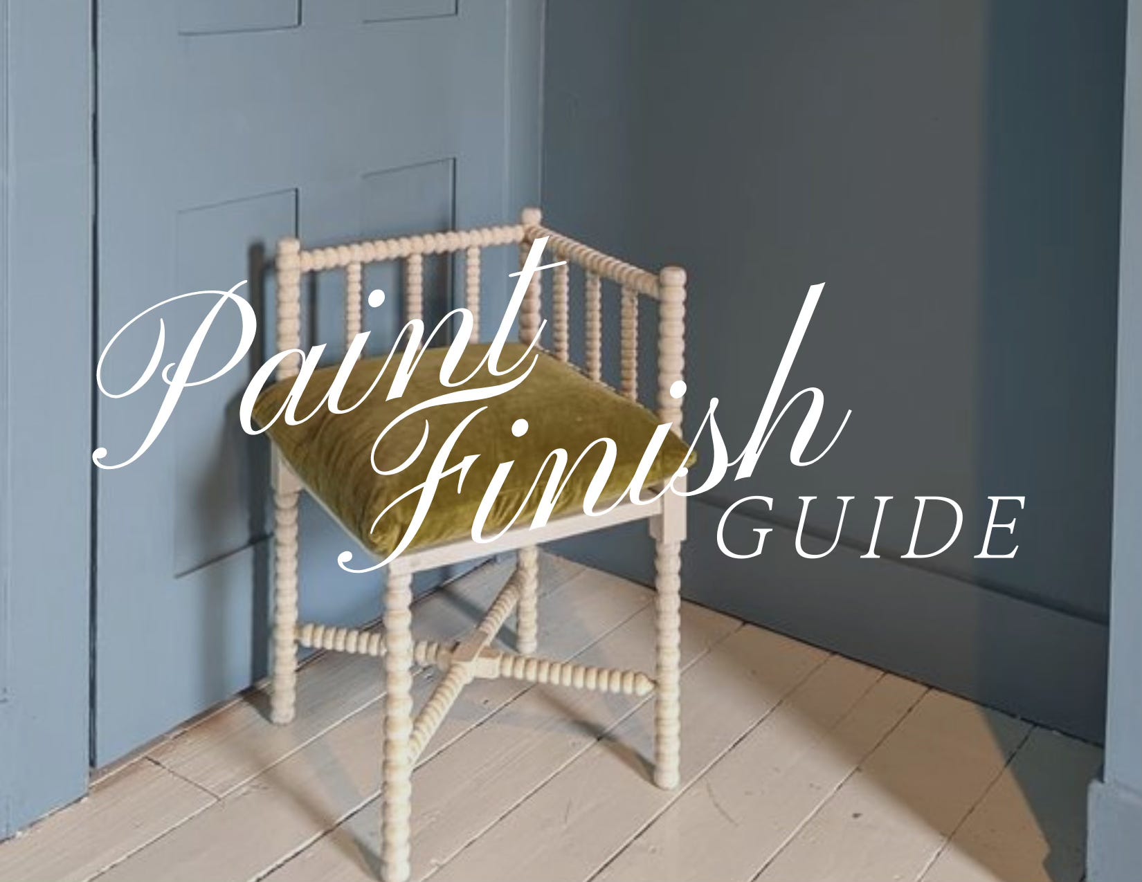
Paint Finish Guide
Paint finishes to use and how to use them.

Selecting a paint color on its own can be difficult, but when you factor in that the paint finish is just as (if not more important) than the color, the possibilities can feel endless. Paint finishes are not difficult to nail down necessarily, but are far from straightforward. Color can give a room a specific vibe or aesthetic, but the finish is what sets the mood. And the goal here is to really nail the combination of the two to make the room feel polished, durable, and purposeful. I think that most people just think of paint finish in terms of purpose, in a “please tell me this will be easy to maintain” kind of way. And yes, that does have a LOT to do with it, but there is also so much more that the finish itself can bring to a space.
So as to not bury the lede, let’s just dive right into it! Here’s a handy paint finish pocket guide that will tell you which finish to use in your space, at a glance.
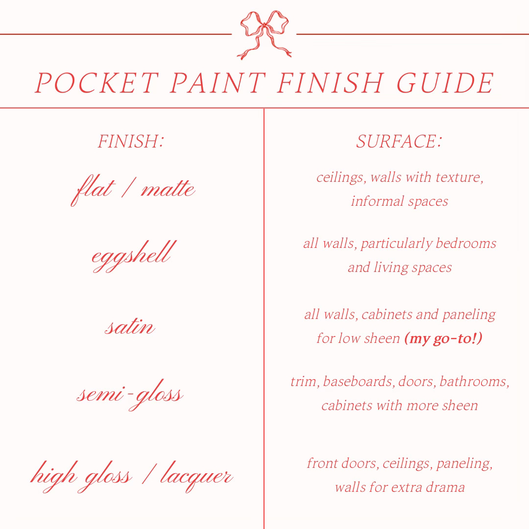
This should be a great resource for knowing which finish you should use where in general, but there’s more to it- and so many more ways to get creative with these “rules” to make them work for you. But first, let’s break down what a paint finish or “sheen” even means, for future reference. Put simply, paint sheen is just the measure of light that is reflected by a paint finish. Usually, this correlates to the amount of enamel used in these finishes, and the more enamel used, the more “shiny” (and usually, more expensive) the paint finish will be. There is a whole science to the different Light Reflecting Value (LRV) that a paint color contains, but don’t stress too much about that and we can cover it another day- today, let’s make sure that we really become experts in the sheen finish options.
Light plays a huge part in sheen, but is only one of the things you need to take into account when you’re selecting the proper finish for your project. In general, there are three things you need to consider when you’re determining finish:
the function of the space- how will you be using this room?
the light in the space- what kind of light (natural or otherwise) do you have?
the condition of the walls to be painted- how smooth or textured is your surface
So, let’s break down each finish and how and where I would recommend using it in your space!
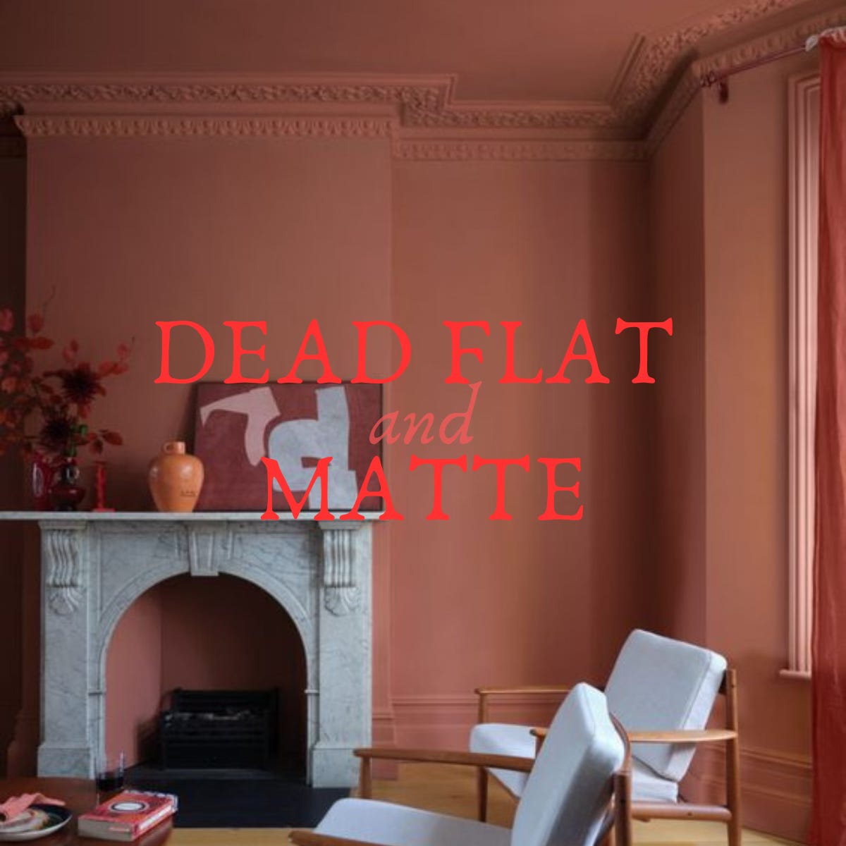
Dead Flat, Flat, or Matte
Depending on the paint brand, this finish could be called any of the above- Farrow & Ball calls its softest and most matte finish “Dead Flat”. Sherwin Williams, Benjamin Moore, and others call their offerings “Flat” or “Matte”, which is often a performance option for Flat with a more durable finish. Flat finish is usually the cheapest option for a paint finish, and this is because there is the smallest amount of enamel in it. Because there isn’t a lot of enamel in the paint, it’s not very shiny- and thus, doesn’t reflect a lot of light. This makes it GREAT for ceilings, because it gives the ceiling a soft, diffused look. Oftentimes ceilings can be bumpy and uneven (both in old houses and in new!), and you don’t want to draw attention to this unevenness with a glossy paint. Remember how older 20th century homes had wild textured ceilings and patterns? Those were the original popcorn ceilings, but they served the same purpose: add tons of flat texture to distract from the uneven ceiling drywall or plaster below. And today, flat paint does the same thing.
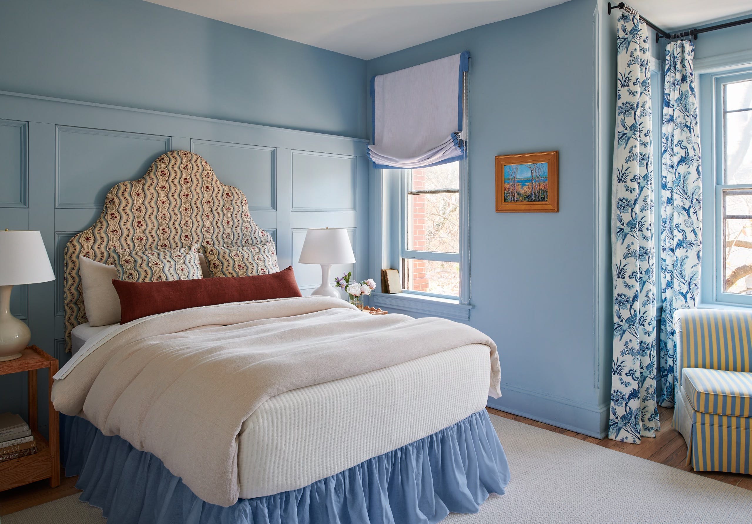
Now, there are differences between this less expensive simple flat option and the Dead Flat or performance Matte offerings I mentioned above. If you’re looking to save some money, or you don’t want to make the ceiling a feature, stick with a simple flat finish on your ceiling. But if you’re looking for that soft and velvet-y finish on your walls or elsewhere, consider a more expensive and luxury finish like Dead Flat or Matte. These options are scrubbable and washable, but will give you that same soft and diffused look on the walls. This looks particularly gorgeous on dark colors, and can give a space an informal and cool feeling (but just note: fingerprints can be visible on all finishes when the color is dark!) So, if you have highly textured or wavy walls and/or ceilings, or you’re looking for a dramatic color that feels softer and diffused, Flat, Dead Flat, or Matte could be the finish for you. Just make sure to think outside of the ceiling and get creative with it! You can see above that they carried this stunning rust color from the baseboard trim, to the walls and cornicing, and onto the ceiling- a fantastic and modern color-washed look for a traditional space.
Where I would not use Dead Flat or Matte: doors, cabinets, surfaces you touch often (unless you’re ok with wiping daily!)
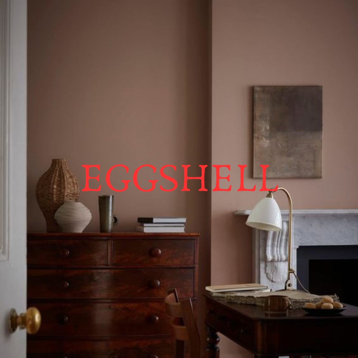
Eggshell
Eggshell finishes are super similar to Satin finishes (more below!), and there isn’t a ton of visual difference between the two. So from the jump, if you’re on a budget and like the look of Satin, Eggshell is slightly less expensive (with slightly less enamel), that can give you similar results. In general, Eggshell is a low luster finish (probably not necessary to say, but similar to the outside of an egg…shell). It’s a step up from a flat, but is still not shiny by any stretch of the imagination, so it’s also great for walls that are wavy or bumpy or textured. It will feel smoother than Flat (which can sometimes have a chalky feel- usually the cheaper options also feel cheaper than the performance or high luster options). Sometimes (and this is only sometimes- it depends on paint line and/or brand), an Eggshell finish can take more coats to fully coat a wall than a Satin finish would.
Where I would not use Eggshell: trim, doors, high-traffic areas, cabinets, bathrooms
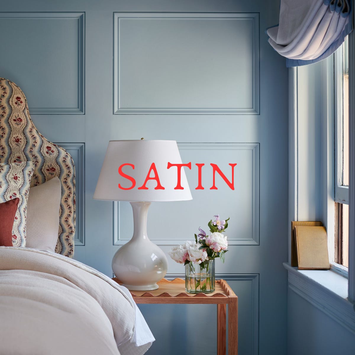
Satin
I’ll just come right out and say it: if you’re unsure of which paint finish to use in your interior walls, Satin is a surefire finish for almost any space, and it’s my go-to. Satin has a similar look to Eggshell but is more durable, and has just a teensy more sheen (i.e., enamel, which helps the durability factor). Satin is not as shiny as a semi-gloss, but is a great option to pair with semi-gloss trim if you don’t want a ton of contrast between the trim and the walls. And while this applies to color theory in general, the darker a color is, the more “shiny” it will appear, even within the same paint finish (i.e., a dark chocolate brown in satin will appear slightly more shiny than a soft taupe in satin). While enamel and sheen plays a huge factor into reflecting light, color does as well- so just make sure to keep and eye on your combination. But in general, a Satin finish will almost never appear “too” shiny, and is such a safe bet for your interior walls. It’s great for living rooms and bedrooms, because it’s still soft and clean, but can also be durable enough to use in bathrooms or kitchens, too. With its added durability, you can take a cloth to it and wipe it down, and it just cleans up and wears so nicely in general (hence why it’s my go-to!)
Again, you want to take into account the surface that you will be painting, as this will show all of the lumps and bumps if they’re there- this also applies to any patched drywall (just make sure it’s been finished really well first!). Satin is also the lowest grade of paint finish that I would consider using on any trim or cabinetry, and is a great option if you don’t want to go with something too shiny. I had my cabinets sprayed in a Satin finish early last year because I didn’t want super shiny cabinets, and it’s held up so well! The finish is soft and elegant, so it’s also great to add just a touch of formality to a space, like a dining room or entry. And you can get creative with it! If you like that monochromatic color-washed look, consider painting all walls and all trim- baseboards, doors, window frames, crown- the same color in a Satin finish. If you want to have a slight contrast in finish but not color, you can paint the walls with a Satin finish and the trim in a Semi-gloss finish in the same color (more on this below). Or, if you like the softer look in general, you can do one color in Satin on the walls, and another color in Satin on all of the trim. There are so many possibilities here, and it’s almost impossible to go wrong with Satin.
Where I would not use Satin: super bumpy walls and literally nowhere else.
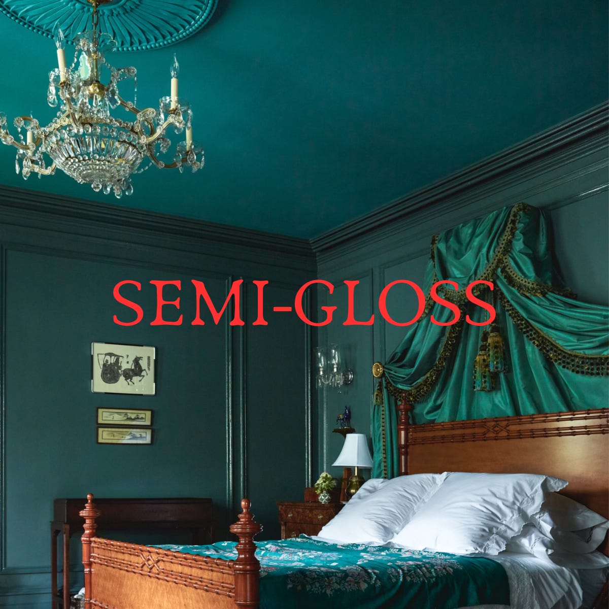
Semi-gloss
This paint finish is maybe the most straightforward, because it has a super specific purpose: it offers a shiny and extremely durable finish to any and every surface. Semi-gloss is the go-to finish for trim and doors, so if you’re in a pinch and can’t decide, this is your safest bet (and I bet you won’t be disappointed). Semi-gloss reflects a lot of light, giving it its shiny appearance, but it’s also just so damn easy to clean. It repels dust (whereas a Flat finish can really hold on to it), and it’s so easy to dust and wipe clean- which is why you see it as the standard for trim. It handles liquids extremely well, which makes it great for cleaning products or rooms with high condensation like kitchens or bathrooms.
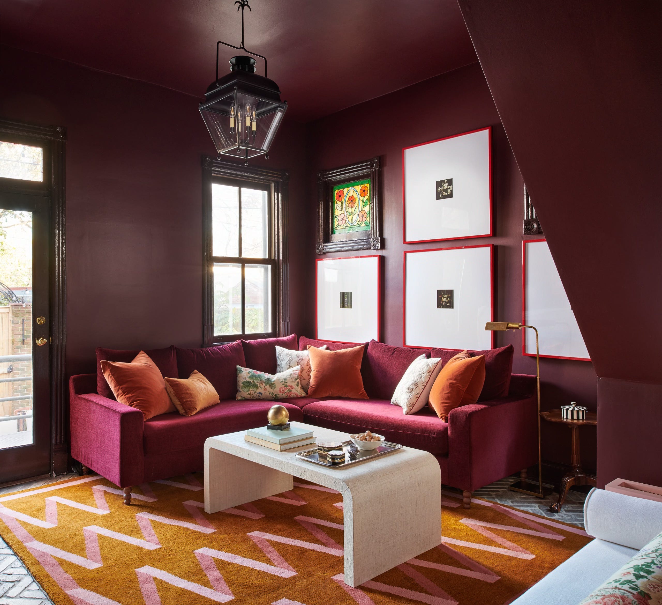
Here’s how you can get creative with it: while I wouldn’t apply it to all of the walls, I do like the idea of mixing finishing in a room with the same color (like the inspiration picture above). We also applied this technique to some deep red walls in a townhouse project we completed a few years ago- we painted the walls a Matte finish, and the paneling and doors a Semi-gloss in the same color. It gives you a dimensional look but also that modern color-washed look that we (still!) love. Alternatively, you can paint the trim a contrasting color in a Semi-gloss finish, and do something softer like Satin or Matte on the walls. This highlights the difference in the colors AND the finish, making the result a bit more dramatic. Of course, you can also stick to a fresh, clean white for a classic (and gorgeous!) look.
Where I would not use Semi-gloss: super bumpy walls with lots of texture, ceilings, and (most) walls (it’s giving shiny but not shiny enough)
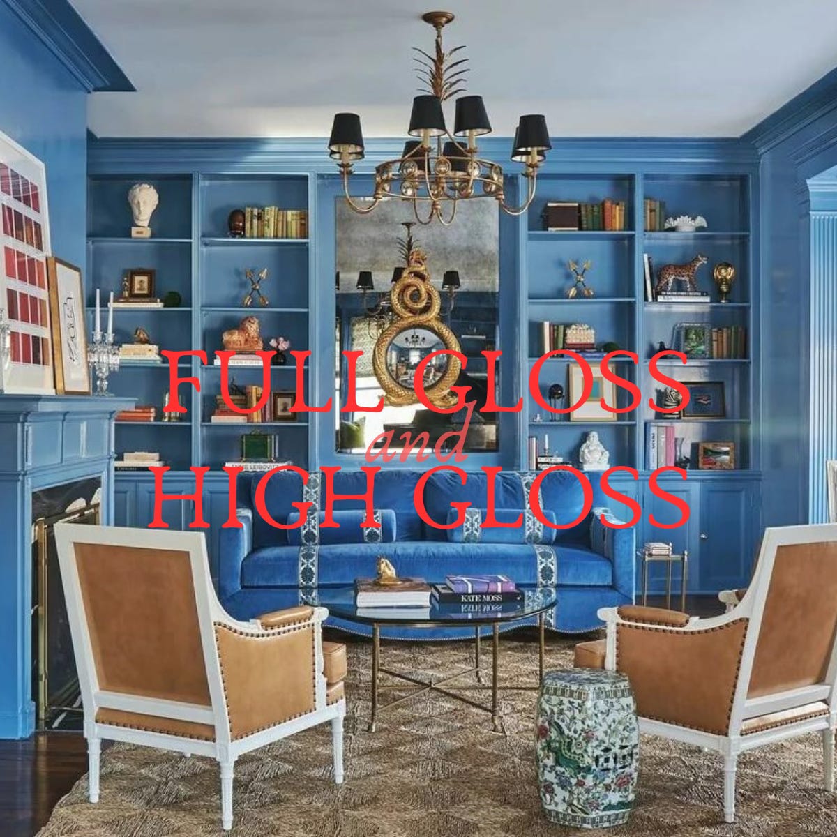
High Gloss, Full Gloss
So here is where we start to bring the drama. High Gloss is different than lacquer (an important difference that you’ll see below!) but still brings an ultimate shine to a space. High Gloss is also the shiniest paint finish that you can purchase retail- it’s almost 100% sheen (i.e., lots of enamel in there), and is therefore super durable. It’s been described has having a “glass-like” sheen, and while I agree that it’s the closest a paint that you can go out and buy can be, it’s not exactly true (you’ll see more of that perfect watery, glassy sheen in a specialty paint like a lacquer). But, if you’re looking for an opportunity go go dramatic and want to stick with a classic paint finish (like something you can pick up at Benjamin Moore or Sherwin Williams), High Gloss is your girl. You’ll see a ton of reflection with this option, so make sure that your walls or surface is super duper smooth before even thinking of applying. And with this light reflection comes a lot of actual reflection, meaning that you’ll see colors of art, furniture, and other accessories reflected off of the paint itself. You can see this in the inspiration picture above, where the items on the bookshelf are almost reflected on the surrounding walls. With this reflective nature can come color skewing- for example, if you have a bright sofa or a bold color rug, these colors will be reflected onto the walls and can tint them a bit. Not a bad thing, but just something to take into account when you’re thinking about a High Gloss.
Just because we’re talking about drama, there are two ways that a High Gloss finish can bring it to a space. One is with the super glossy finish AND color, like the image above, which just packs a punch visually and texturally in a space. If you want to be dramatic but you’re a little unsure of a bold color, High Gloss can also look fantastic in a neutral color or even white. This is a great way to get an almost glam look but still keep a space feeling soft and chic. High Gloss will feel like a solid enamel (kind of like fingernail polish) when you touch it, so it’s safe to say it’s incredibly durable. It also feels thicker and harder on surfaces like wood, so it’s a great way to add a super lustrous and solid texture to a space. I love it on trim and walls, or just trim that’s painted the same color as the walls (like we talked about with semi-gloss above, but with the wattage turned up). It’s also fabulous on cabinetry or a single piece of furniture, just make sure that it’s SO SO SMOOTH.
Where I would not use High Gloss: super bumpy walls or surfaces with a lot of texture, bedroom walls (maybe a bit too shiny and glaring for calming slumber)
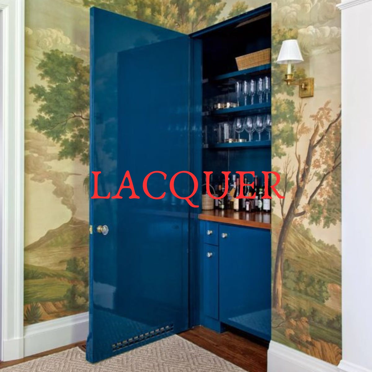
Lacquer
Lacquer really is that girl. She’s the moment, she’s an icon, etc. etc. But one thing that’s really important to note: true lacquer is a specialty finish, and the results are not achievable with the finishes listed above. There are two things that make lacquer different from the other finishes we’ve discussed today: one is the sheen (unmatched and the absolute shiniest and most lustrous finish you can get), and second is the process in which it’s applied. Fine Paints of Europe Hollandlac lacquer paint is the best and most used lacquer finish on the market, and it will give you the most gorgeous glossy finish- think of a deep black piano. It also feels hard (like a gel nail polish, for example). High Gloss paint is a bit more forgiving, and can be brushed or rolled on (by an experienced painter), but Lacquer paint is sprayed on in thin coats with lots of sanding in between- even a speck of dust can show up in the finish if it’s not removed or sanded properly. The paint itself is more than just enamel, like the paints above, but rather has resin and other ingredients to give it its hard and shiny finish. Because of this, it’s SUPER durable (as is High Gloss), but this is everything to the ultimate. You also can’t (shouldn’t) do this yourself, and not every painter out there is trained in how to apply, so make sure you’re doing your research if you go this route. The room or space needs to be sealed off for spraying and drying, so no flying particles like dust can interfere, and each coat is sanded with a fine grit in between until the finish looks like water. Because it’s so labor intensive, it’s incredibly pricey- I was considering this for my dining room ceiling before I decided on an all green monochromatic look, and the estimate with my painter came in at a cool $7k for a 12’x12’ area.
I don’t think you need to think too hard about how to use this paint creatively, if you’re going this route- the finish itself is the statement here, even more than the color. I love this in a neutral as much as I love it in a color, and I especially love this when applied to a ceiling in a contrasting color to the walls. Because there is so much prep and sanding that goes into this, this is one shiny finish that I think is ok to use on a ceiling without worrying about lumps and bumps! I also love it on built-ins and applied moldings, or even a single piece of furniture (a traditional antique piece refinished in lacquer is a great combo of old and new). You’ll see that this fun pop of cobalt blue applied to the inside of the jib door in the image above is such a fun and unexpected surprise in a traditional room.
Where I would not use Lacquer: on all walls + ceilings + trim, as this can feel TOO reflective and harsh (but there are exceptions to everything!)
So, that’s the run down on general paint finishes. BUT before we go, let’s talk about Farrow & Ball specifically for a second, because their paint finishes are named slightly different things (like mentioned above with Dead Flat). Here’s a quick run down on their lingo and naming system:
Dead Flat- their flattest, matte paint that’s also durable (notably different than a cheap Flat finish from a generic brand) Great for everyday use and high traffic areas, like bedrooms and playrooms, where you want a rich look.
Modern Emulsion- this is also a durable finish, but softer and not as flat as Dead Flat. It’s washable and wipeable, but also has a moisture guard so it’s great for bathrooms and kitchens and any room, really.
Estate Emulsion- SUPER matte and chalky, and great for ceilings and anywhere that you won’t be touching or needing to wipe down often. A chic look, but maybe not great for sticky fingers or high traffic areas.
Modern Eggshell- this is similar to Satin, and is super durable and wipeable. It has a mid-level sheen, so if you’re looking for some light reflection, this is gorgeous (I love it on cabinets or floors!)
Estate Eggshell- similar to Eggshell above, it’s slightly softer than Modern Eggshell. (anything with “estate” on it from F&B tends to be more matte)
Full Gloss- this is similar to High Gloss above, and is well and truly shiny- the glossiest you can get without going full Lacquer!
Exterior Eggshell- for anything outside that you don’t want super shiny, like a door (which Full Gloss is great for to get that reflective finish). Great for wood and weather.
I’ll leave you with a few paint color combinations and finishes that I’ve used in past projects, just for reference- I spent too much time talking about the finishes and not the colors themselves, so this can be a little teaser until we talk more about paint color combos I love in another newsletter!

EXCITING NOTE! I’m taking subscriber submissions for design dilemmas. Have a space that you have 1-2 questions about, or something that’s stumping you? Send me an email (shannon@shannonclaireinteriors.com) with the details and I might share it in a future newsletter.